Paycrave
Paycrave is an ios mobile app
design.
Search for local food
trucks
& discover new menus.
Paycrave is an ios mobile app
design.
Search for local food
trucks
& discover new menus.
Customer reviews from the competitors social media pages and app store revealed that while the competition was doing a decent job at listing food trucks and coordinating trucks for pre-planned events, many of the features customers expected in a food truck app did not exist or did not work properly.
"
The app shows trucks in my area but I'm not able to view the menu, pricing, or even contact info.
- comment from competitor's reviews
The goal of Paycrave is to allow users a hassle-free way to discover nearby food trucks, view menus, and purchase food. This goal is accomplished through an easy to navigate interface that provides users with the information they need to order from a food truck that meets their needs.
To define the requirements of the application I began by visiting local food trucks as well as placing orders from food delivers apps. My goal was to understand exactly what a user expects and where there may be gaps in the process. I then conducted a competitive analysis to identify what the competition is doing right and what the existing pain points are.
Food truck industry research gathered from 1000 consumers by aytm.com (ask your target market) revealed what mattered most to consumers when visiting a food truck.

| User Story | Task | |
|---|---|---|
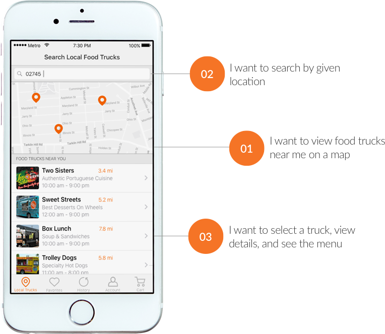
| As a user | I want to view food trucks near me on a map | |
| As a user | I want to search by given location | |
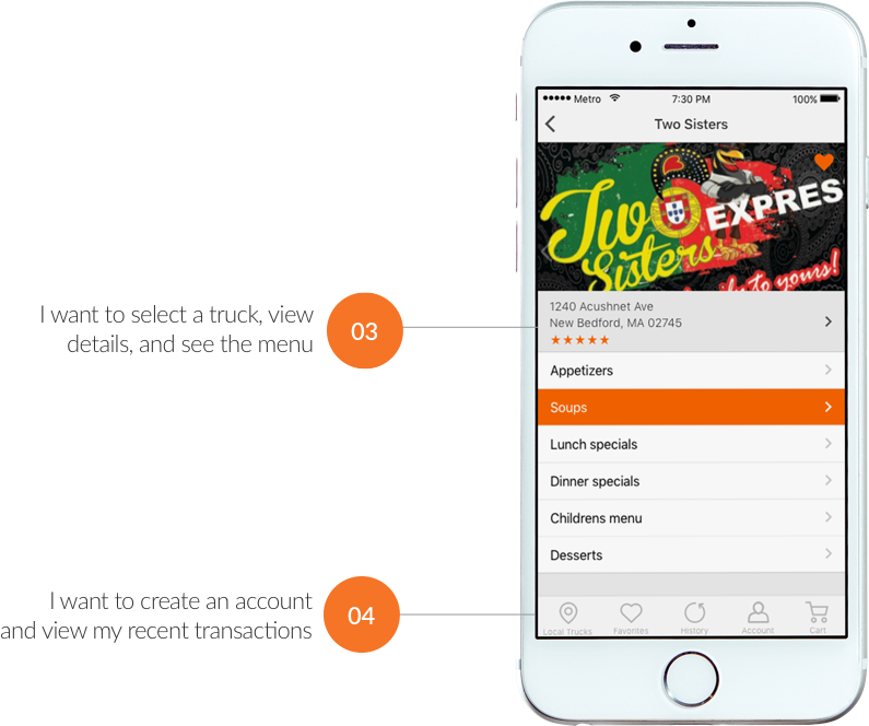
| As a user | I want to select a truck, view details, and see the menu | |
| As a user | I want to create account and view recent transactions | |
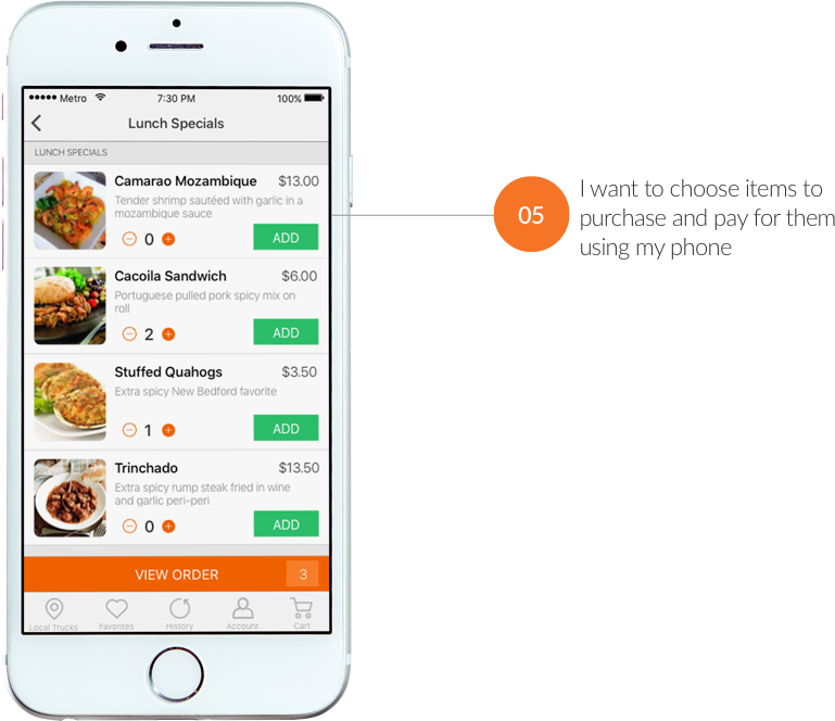
| As a user | I want to choose items and pay for them using my phone | |
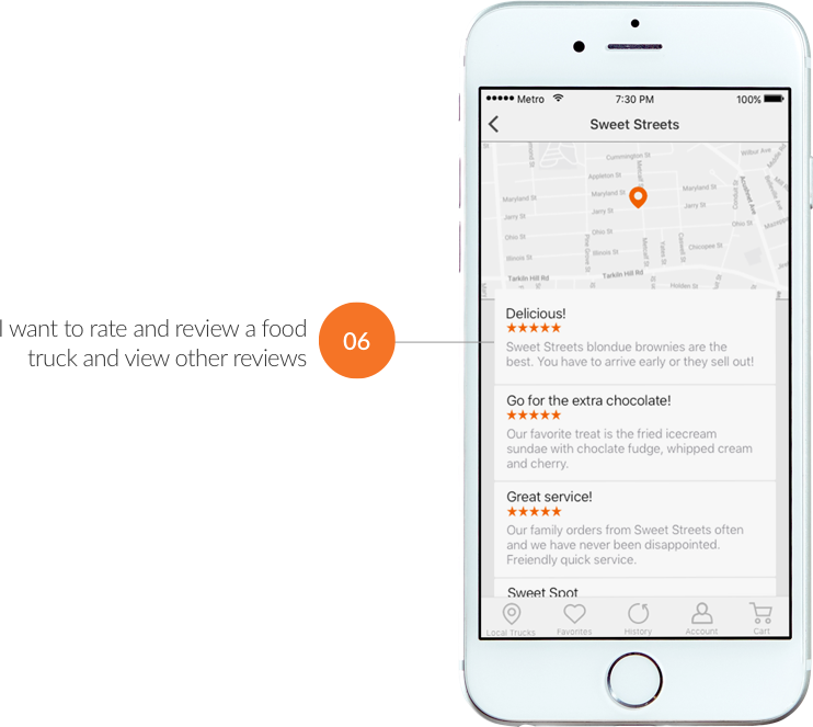
| As a user | I want to rate/review a food truck, and view other reviews | |
Research conducted by conversionxl.com revealed that 86% of users report being bothered by having to create new accounts and that there is a 66% drop in failed logins after introducing social sign in.

I used Peek user testing to test early in the process. Testing revealed that less than 10% of users attempted to enter and save their default payment method before making a purchase and that most users do not want to enter their card information until after placing an order.


The colors of the brand are bold and memorable. I chose orange as the primary color. According to color theory, orange is know to subconsciously induce hunger. Feeling hungry?
#F76400
#EAEAEA
FF8128
#4A4A4A
#FFFFFF
#2CC36B
To ensure Paycrave users have a seamless experience I ran tests on users flows for common tasks such as placing an order, reading reviews, and each task defined in the user stories.
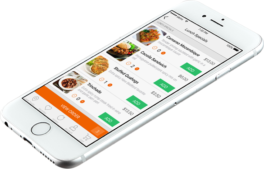
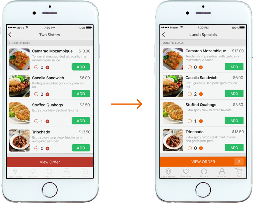
In person user testing revealed that users were confused when trying to add a menu item to their cart. After selecting “ADD” they continued to select “ADD” expecting to see a confirmation that their item had been added. To solve this problem, I added an item total within the “VIEW ORDER” button.
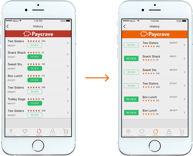
Testing also revealed that the design required users to take too many steps when trying to view the reviews. To solve this problem, I added the reviews for each food truck to the top of each menu. This allowed users to access reviews in one click.
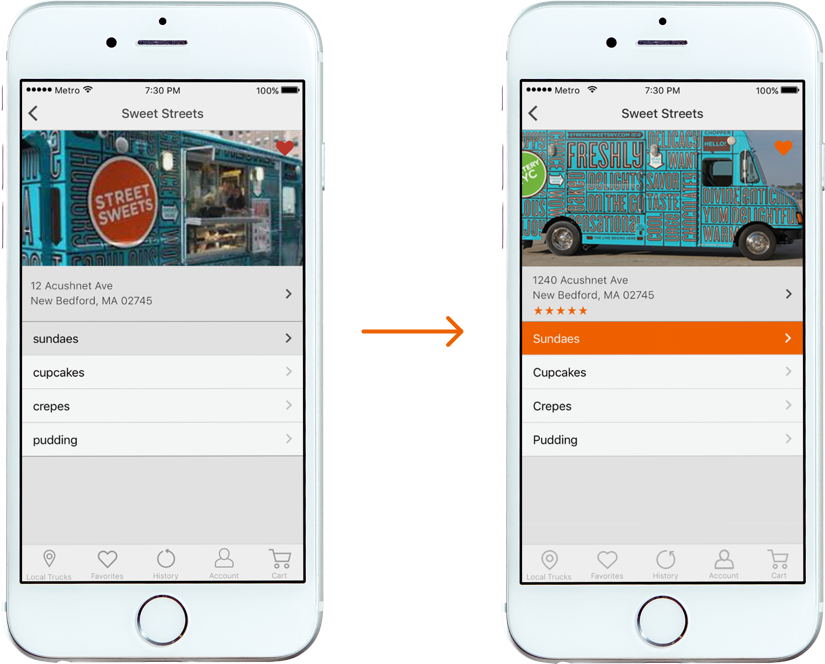
During the design phase attention was given to ensure minimum target touch points, and margins aligned with ios guidelines. I also updated the button styles to be consistent throughout the app.
After a few iterations on the design, I ran several rounds of user testing to ensure that the designed solved the problems users were experienceing while using competing apps. Providing users important information including location, distance, food type, and hours made their initial interaction with the app smooth and they were able to complete each task seamlessly..
The feedback from user testing steered the design of Paycrave. I learned just how valuable it is to watch users interact with the prototype. Making small changes like allowing the user to place their credit card details after placing an order rather than requiring details during sign up was a simple way to improve the user experience.
view prototype